Apple UX/UI is Regressing?
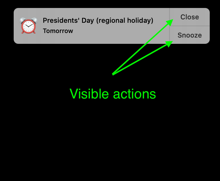
Here we go again. One more bad UX/UI pattern amongst many in macOS Big Sur. In macOS Catalina, notifications had their actions visible and can be acted upon with a single click.

With multiple notifications, the story is the same. All of them are actionable immediately.
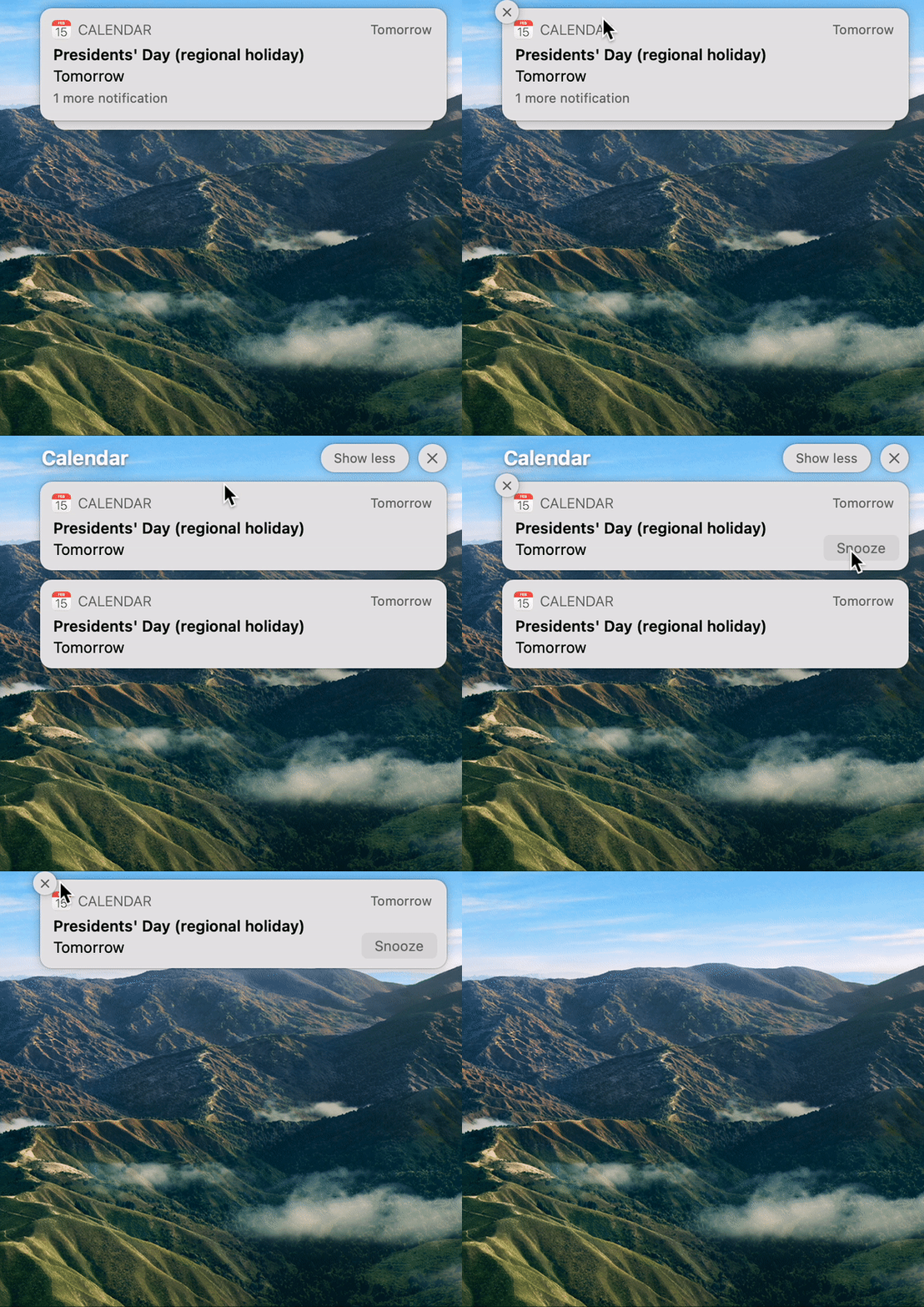
On macOS Big Sur, a new feature is introduced to group notifications and allows them to be dismissed faster in theory. However, my observations are completely opposite and causing a lot of frustration. There are at least 9 different things going on to dismiss notifications:
- Hover over the notification bundle.
- Wait for the animation to complete to see the X clear icon. But that's to clear all (Not obvious). It's hidden by default.
- Click anywhere on the notification popup except for the bottom right where the "Snooze" button magically appears out of nowhere (after some animation time).
- Wait for the reveal-all animation to complete.
- Now, we see all notifications stacked. But no obvious way to see how to dismiss them. That's because the X clear button is hidden again.
- Wait for clear button animation to complete.
- The same exact X button on the top left, which was invisible is now visible, but with a different function, ie. it now clears the top-most notification. Previously, the same button was to clear all notifications.
- Wait for another animation as the stack reshuffles itself.
- Oh, but while it is done shifting, the clear X button is on its way to disappearing! With an animation!
Here is how it plays out:

Notifications are one of the most used user interface interactions and any kind of friction leads to frustration since notifications are by definition an interruption to the workflow, and thereby the urgency to act upon has higher criticality than other actions. Either the user wants to quickly dismiss it or act on it.
I can only conclude that some combination of the following is true:
- Apple gets undue credit for its UX/UI.
- Apple itself has been focusing on fashion than usability. Deliberately.
- Apple UX/UI team is getting worse, perhaps no strong personality at the top to tell them it's shit.
- The entire world of UX/UI is getting worse every day, Apple is just part of the larger shift.
- Apple is defining "trends" that are followed by the rest of the industry, thereby regressing further into a non-stoppable spiral.
- Users are expecting less and do not care as much. Users are regressing worldwide.
- Users want animations and decorations.
- Public outcry is lacking.
- Public outcry is not being heard.
At this point, I am so frustrated with macOS Big Sur (and all the regression since macOS Tiger actually). Everything from title bar height, too much white space, butchering the density of information throughout the OS, animations overload, hiding crucial information for minimalism and cleanliness sake, hiding borders and separators, reducing the contrast in UI elements, etc.
I've disabled the damn notifications permanently using a workaround that involves setting the "Do Not Disturb" mode from 10 pm to 9:59 pm. So at 10 pm, I get all of them simultaneously and I can set aside some time to dismiss all with a cup of calming tea.
Thoughts? Discuss on HN.