Berkeley Mono February Update
Hey Gang! First of all, thank you to everyone that participated in the Beta program. Feedback is very much appreciated.
Here is a quick update on the progress:
Website - Berkeleygraphics.com
It is already up: https://berkeleygraphics.com but does not have the Berkeley Mono pages yet.
Stack is extremely simple:
- Python Flask
- Docker
- AWS S3
- Completely server-side (No JS at all)
- Payments through Stripe
- Sentry (self-hosted) for alerts
- AWS Cloudwatch for logs
- Debian Bullseye 11 (self-hosted server)
- Cloudflare + Cloudflare Analytics
- No cookies
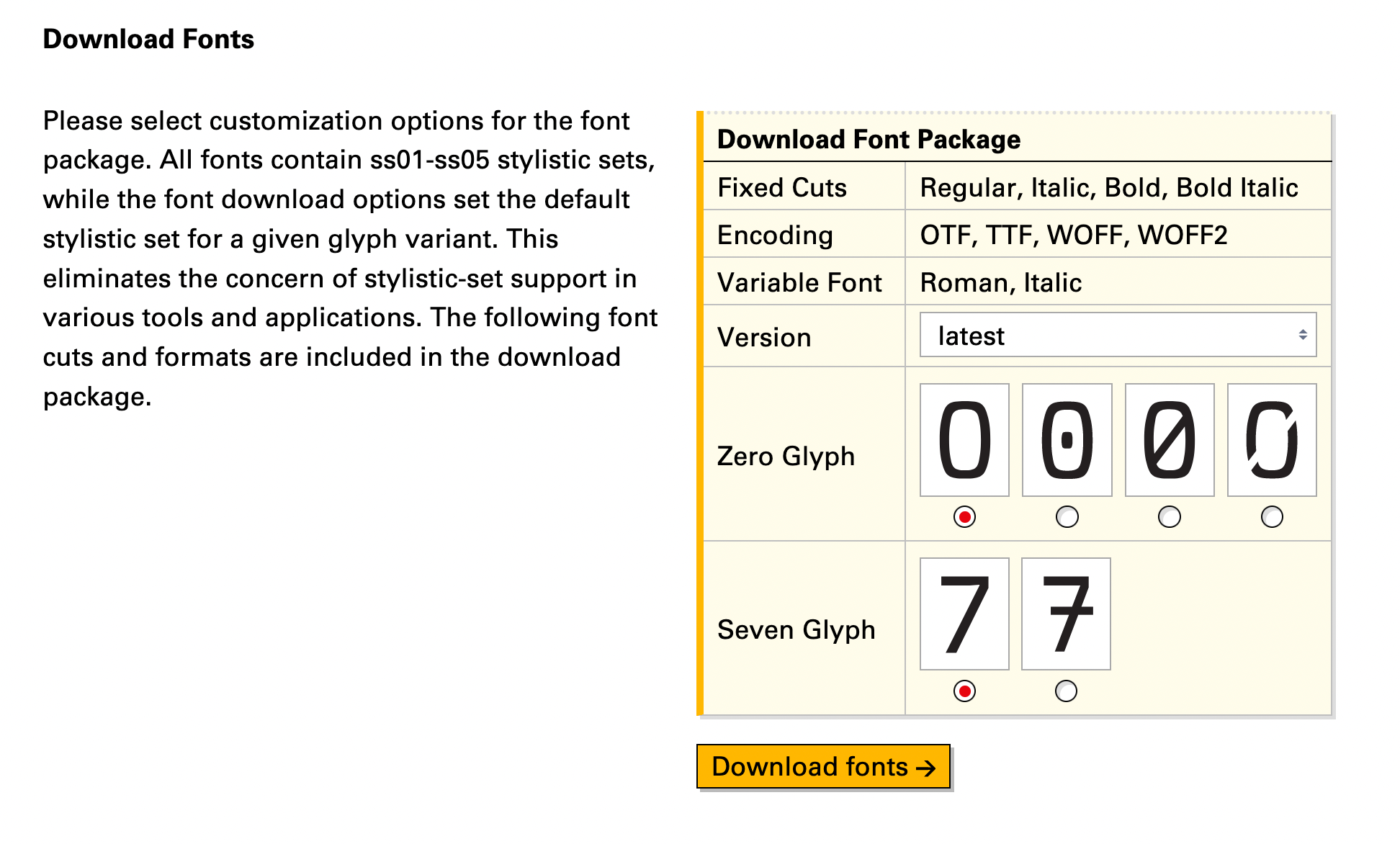
I had fun designing this little download module (only visible after you purchase Berkeley Mono). It allows you to customize the font files for particular stylistic-set defaults. Basically, no need to change anything in your application, font files will be prebuilt for your liking:
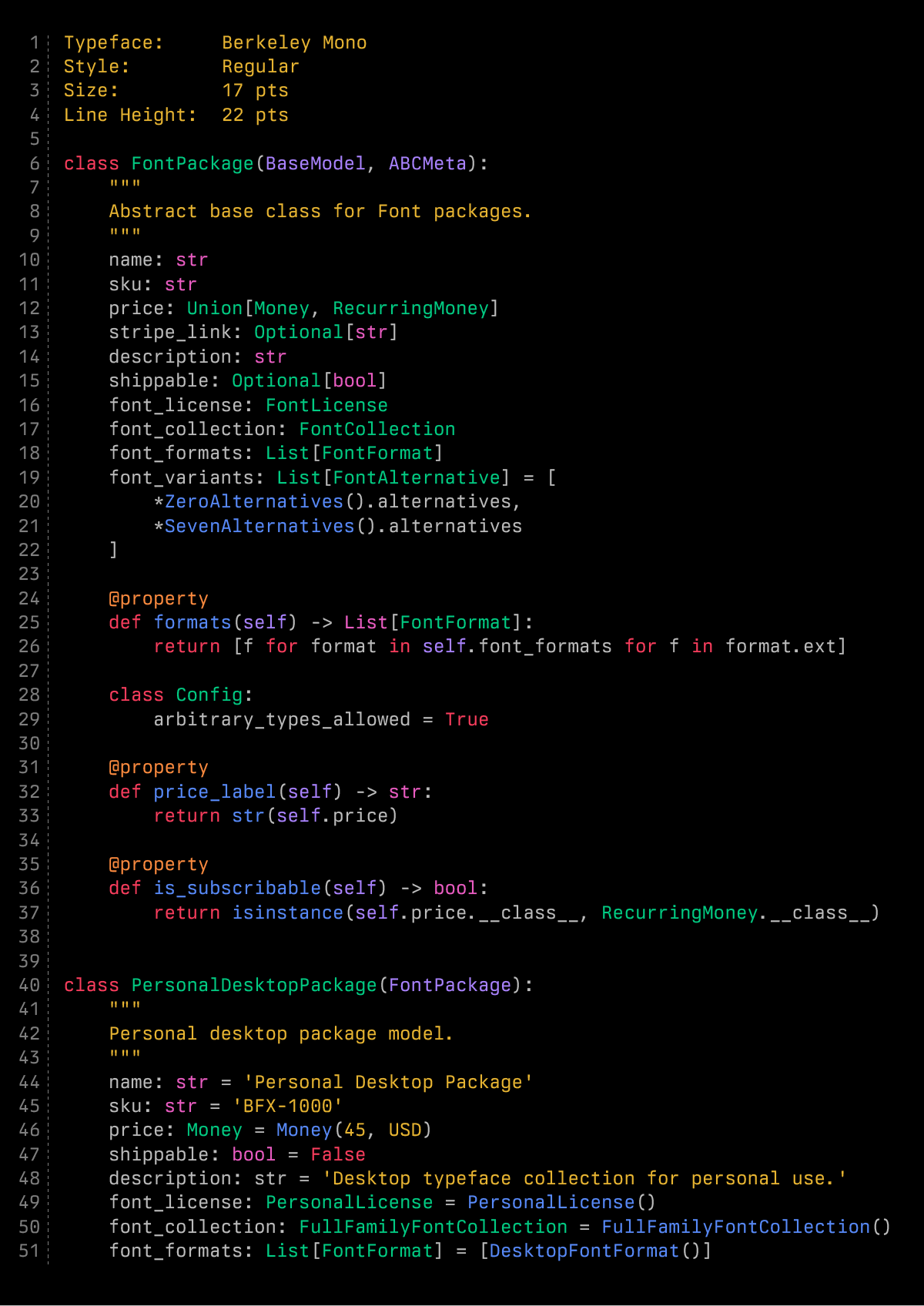
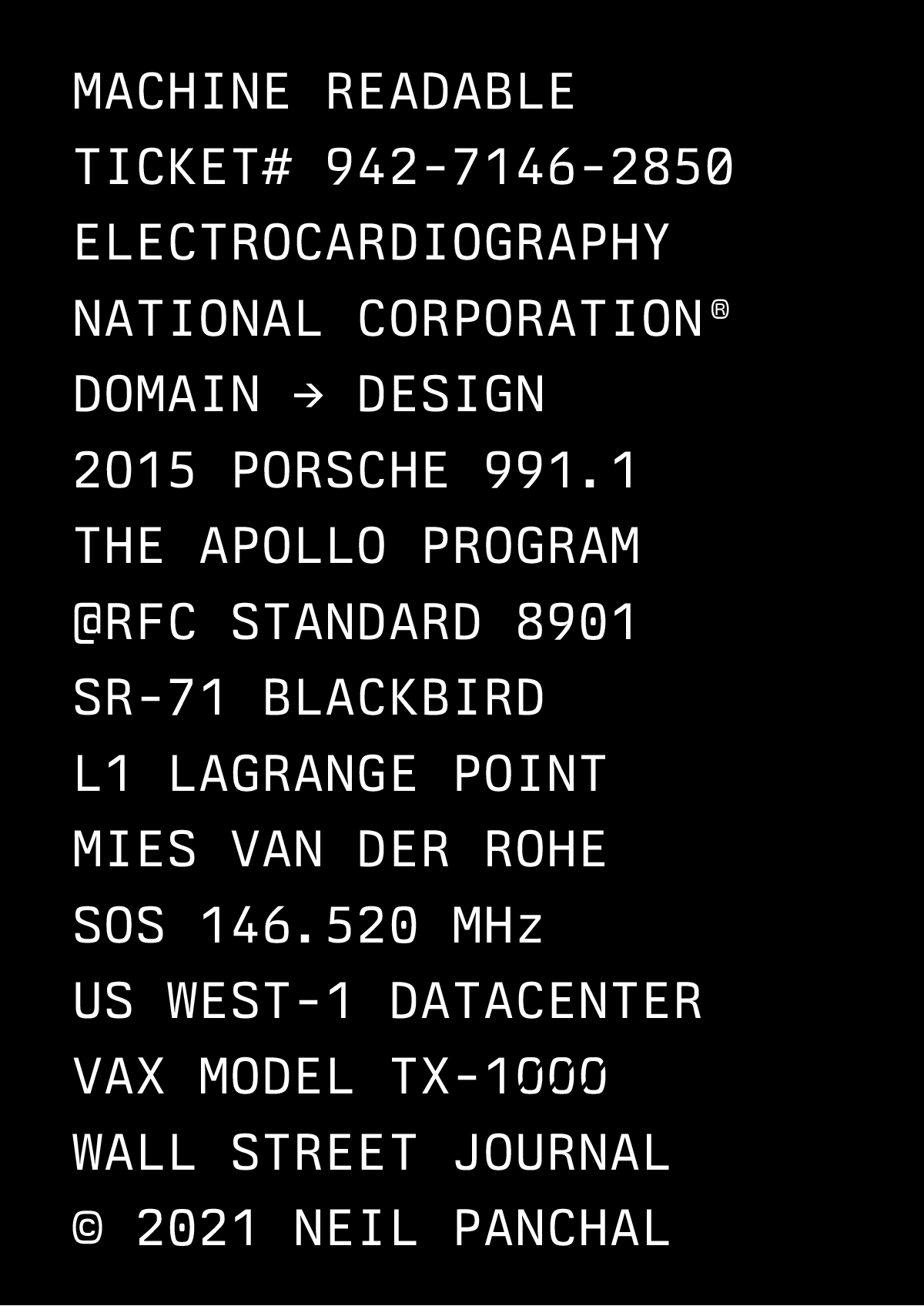
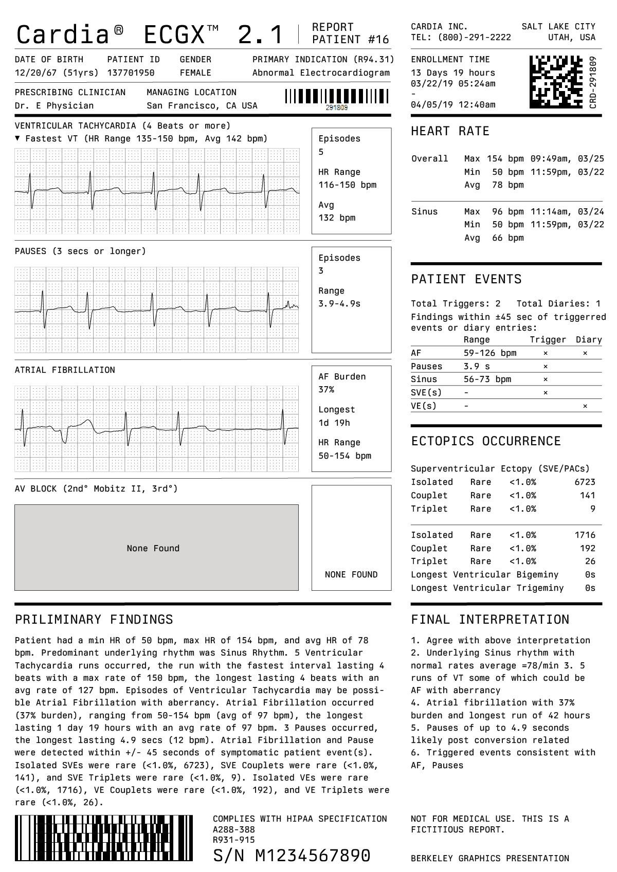
Berkeley Mono Specimens
This is the marketing bit. It's fun but also extremely time-consuming:
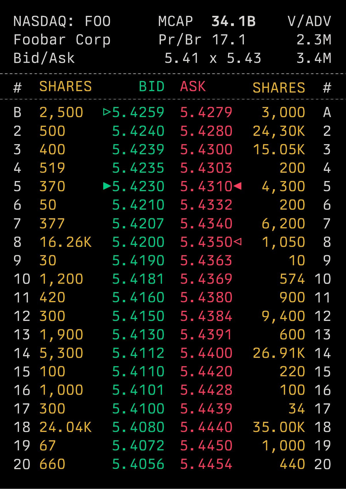
Italics
I am thrilled to announce, absolutely classic 16º obliques. I think Oblique works better for code than true Italics. Also, in the context of Berkeley Mono, it is difficult to design flamboyant Italics while also being sufficiently legible, straightforward, and code-friendly. Personally, I am not a fan of Operator Mono from Hoefler & Co. although many people seem to like that sort of a thing.
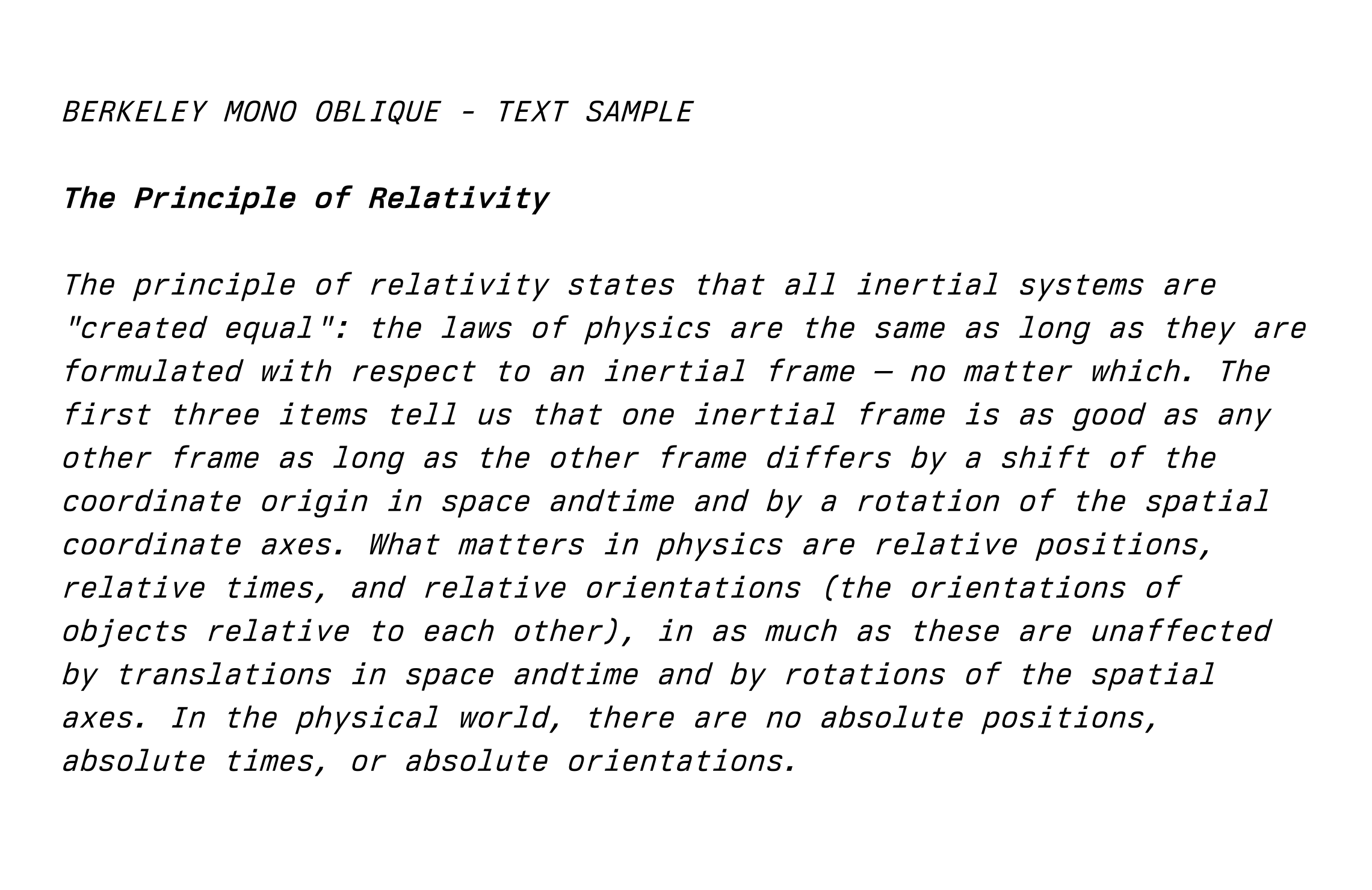
Designing proper obliques takes a long time because essentially it is designing a new typeface from scratch (almost). It is not a matter of slanting glyphs and calling it a day. Here is the most basic example. It gets quite involved for complicated glyphs such as f or R:
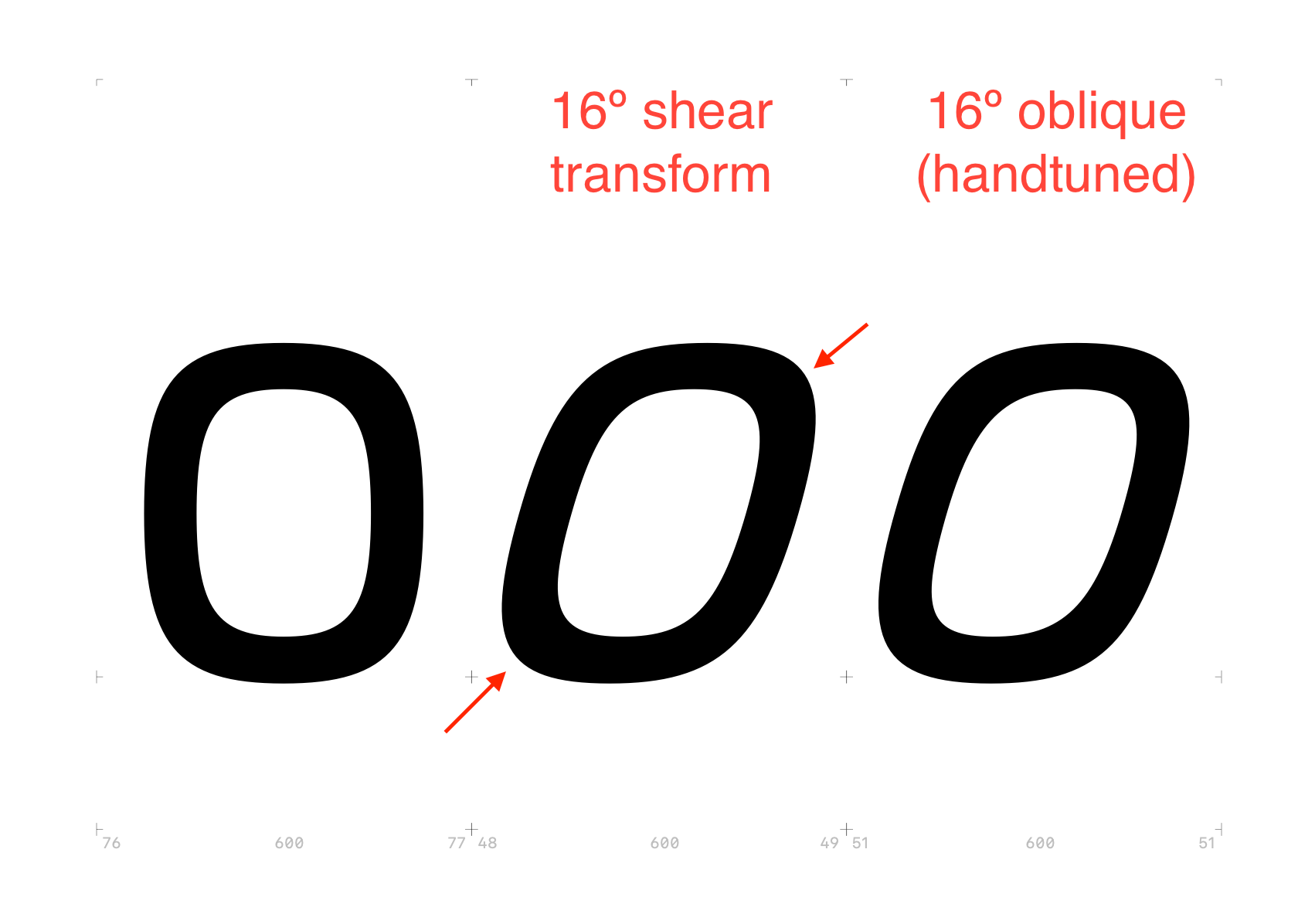
With a simple shear transformation, the corners get disproportionately heavy. This needs to be hand-tuned with a combination of shear + rotation (clockwise) + elbow grease.
Why 16 degrees? It is basically the classic oblique angle of Univers. Modern Univers from Linotype (now Monotype) uses a modest 12º italic angle. I think that's too boring. Not 70's and 80's enough. More importantly, you want to easily distinguish between Roman and Italics. If they're too similar, it misses the point entirely.
Broad Language support
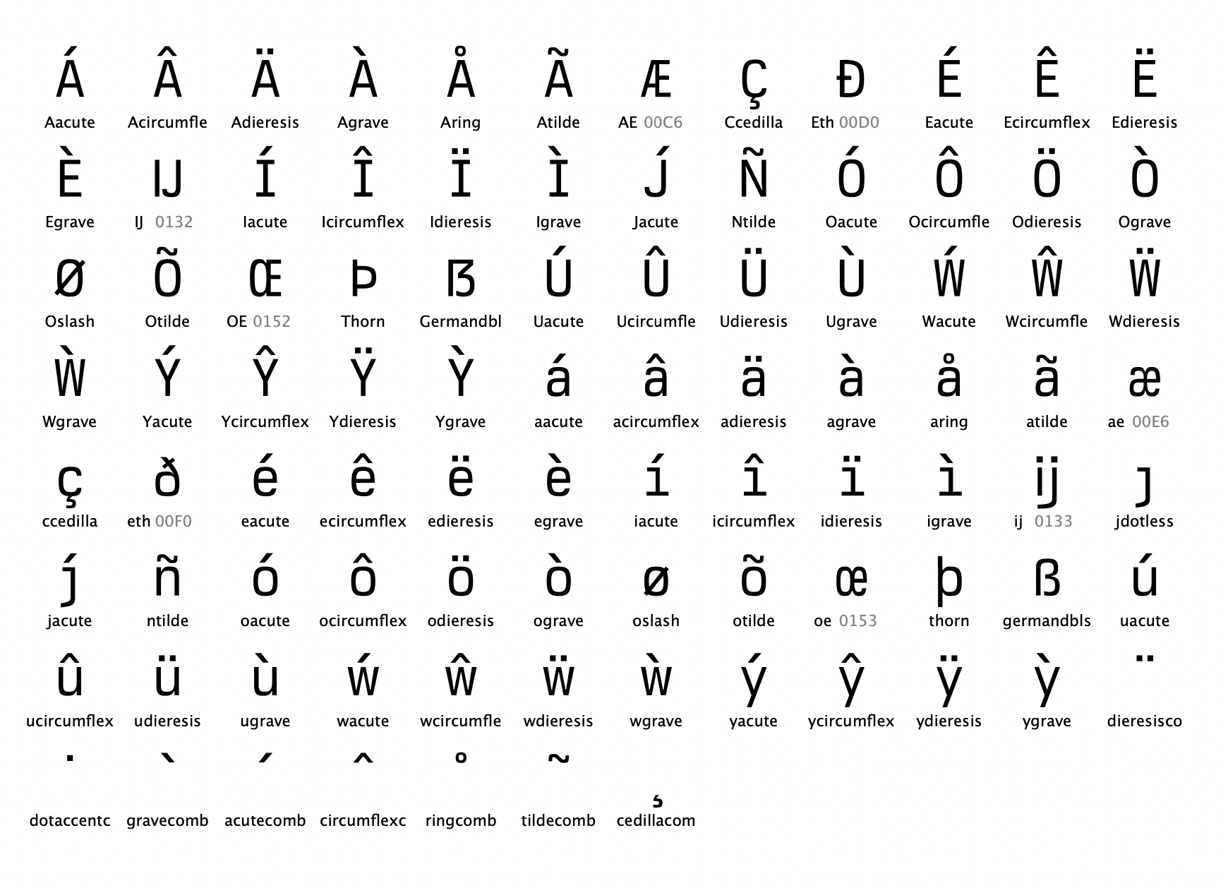
Berkeley Mono will have full support for the following European languages:
- Albanian
- Croatian
- Czech
- Danish
- Dutch
- English
- Estonian
- Finnish
- Georgian
- German
- Icelandic
- Irish
- Italian
- Latvian
- Lithuanian
- Norwegian (Bokmål + Nynorsk)
- Polish
- Portuguese
- Romanian
- Romansh
- Serbian
- Slovak
- Slovenian
- Spanish
- Swedish
- Turkish
- Welsh
As well as Asian anglicization of:
- Filipino
- Indonesian
Berkeley Mono complies with the following ISO 8859 standards:
- ISO 8859-1 Latin-1 Western European
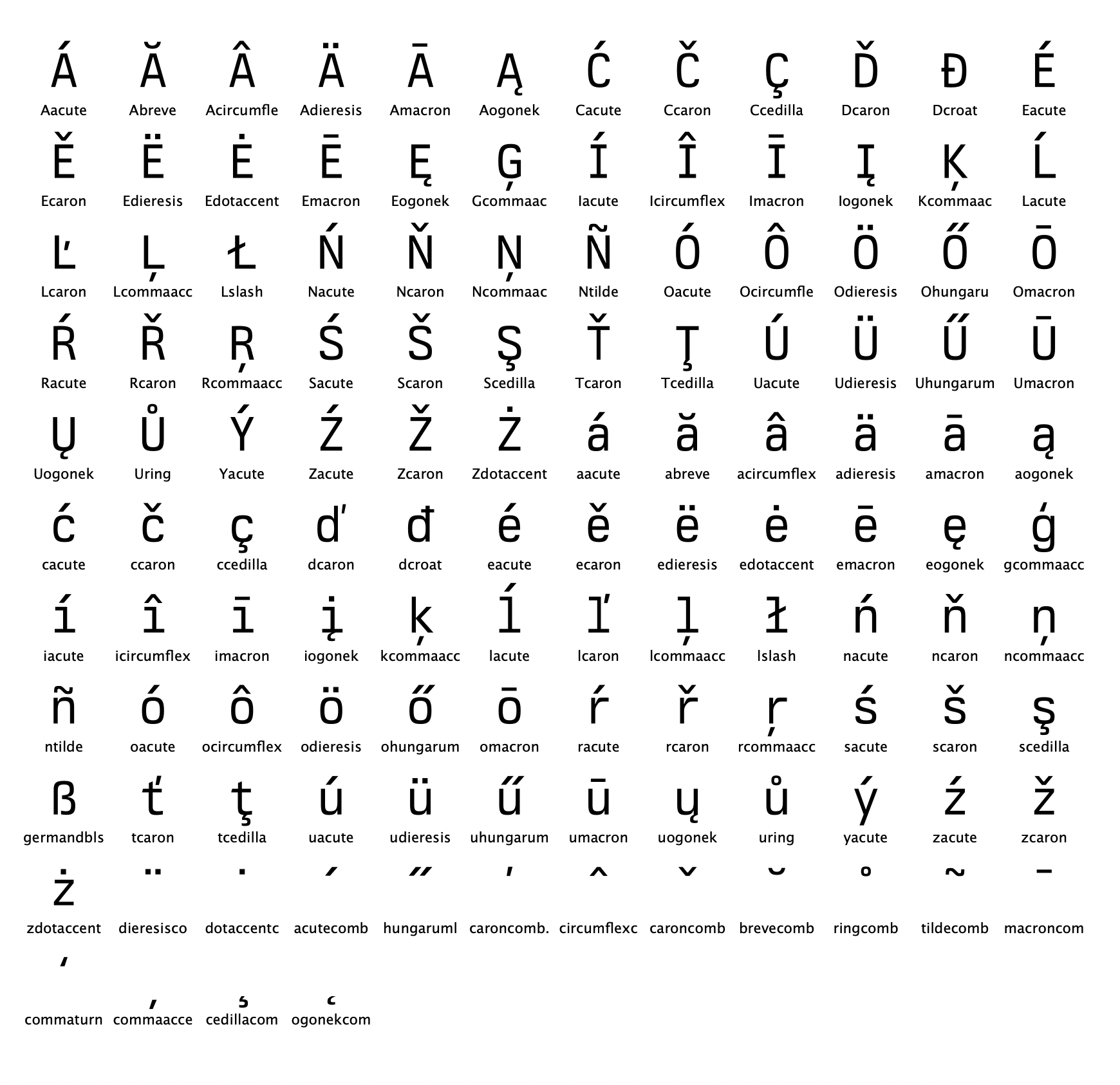
- ISO 8859-2 Latin-2 Central European
- ISO 8859-3 Latin-3 South European
- ISO 8859-4 Latin-4 North European
- ISO 8859-9 Latin-5 Turkish
- ISO 8859-10 Latin-6 Nordic
- ISO 8859-13 Latin-7 Baltic Rim
- ISO 8859-15 Latin-9 Finnish, Estonian
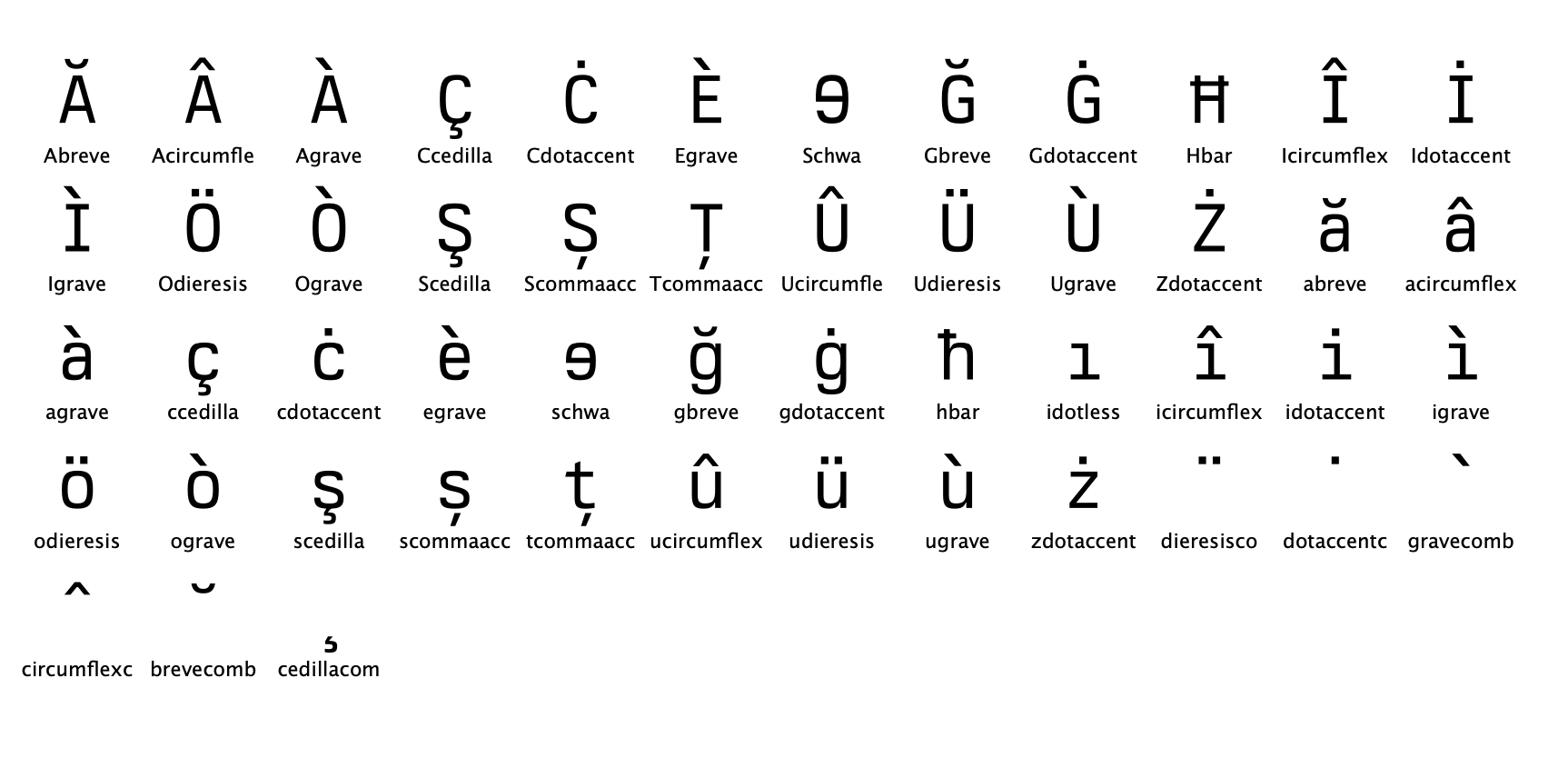
- ISO 8859-16 Latin-10 South-Eastern European
Basic Latin Support
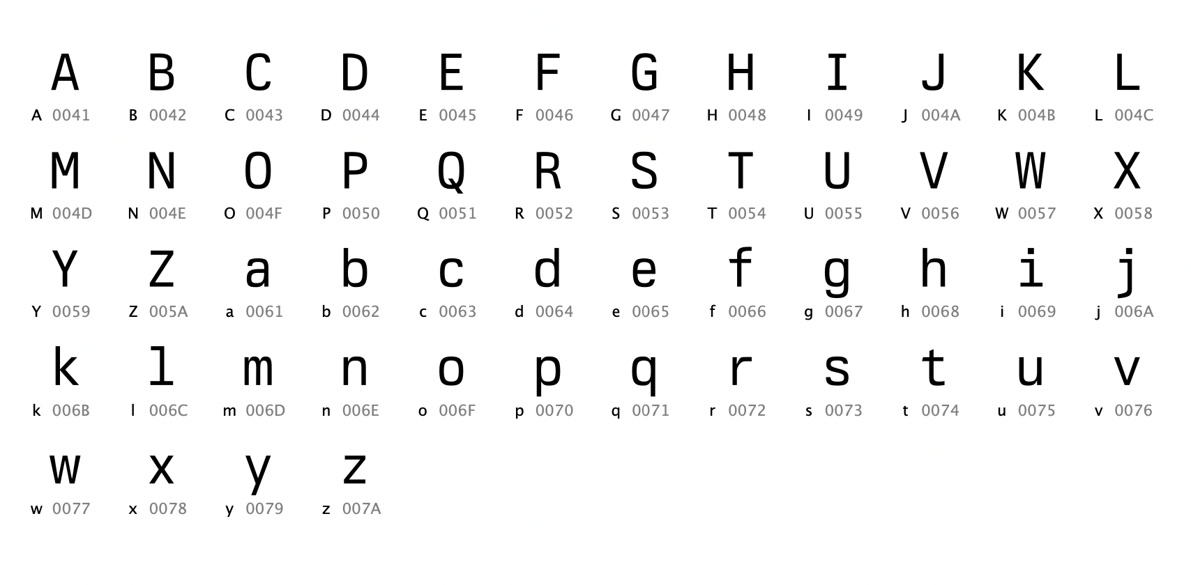
Western European Support
Central European Set
South-Eastern European Set
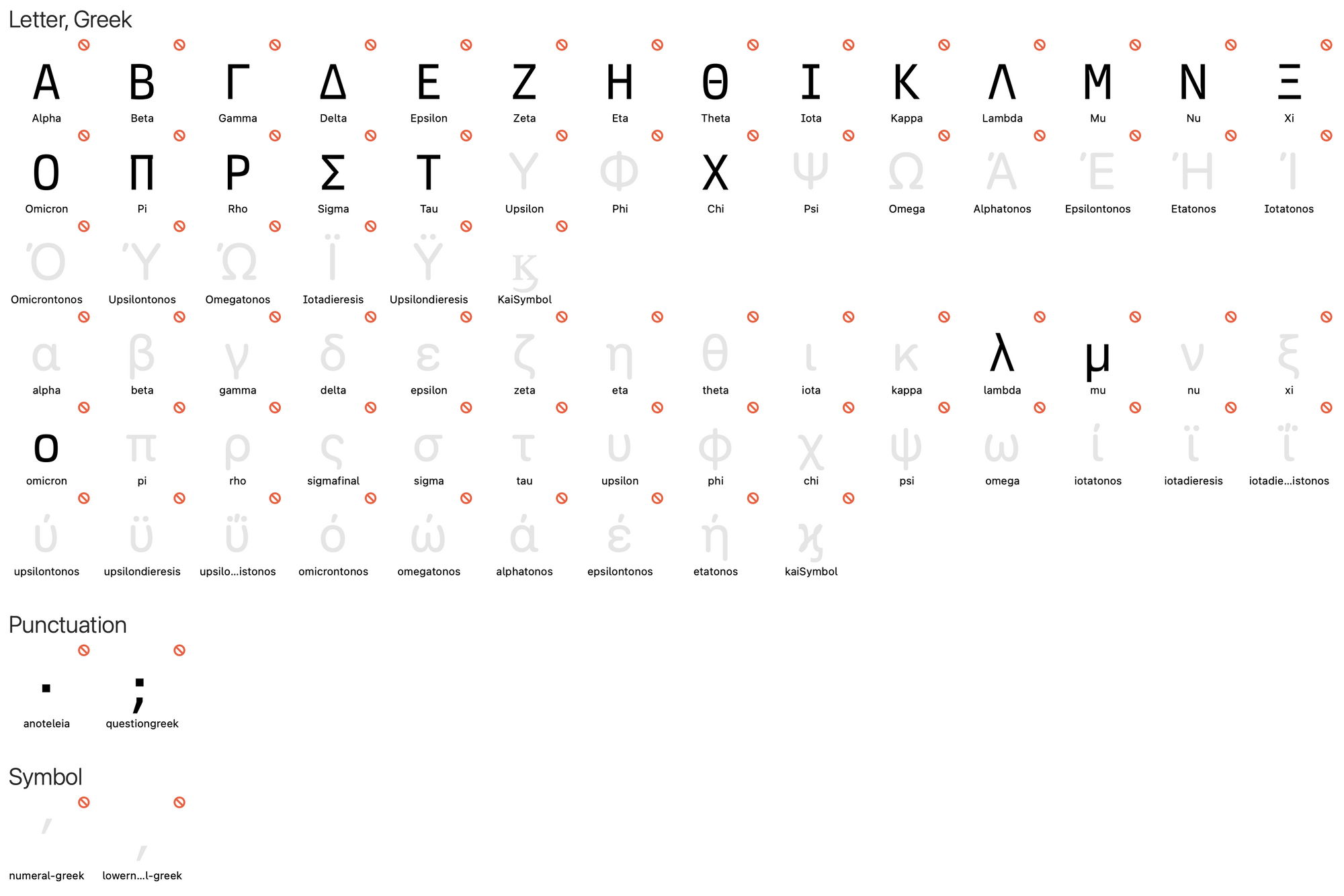
I am also planning for Greek language support but it seems to have stalled for now due to other activities:
That's all for now. Stay tuned!
The end.