Dear Spotify. Can we just get a table of songs?
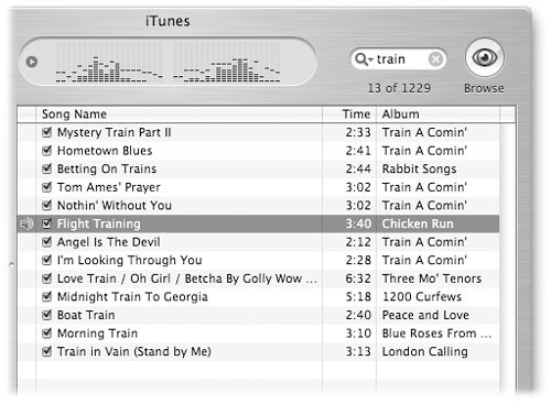
Dear Spotify. I tried to search for podcasts on your Desktop app. I know you're into fancy cross-platform Electron framework. I've come to terms with it. It's fine. It'll do. But, your understanding of interface design seems like it needs a bit of a history lesson. Back in iTunes Good Ol' Days™ edition, we'd get our search results in a list like this:

Stick something in the search bar. Get results in a list. Life is good. Clear, concise, dense, and most importantly: FUNCTIONAL. It works.
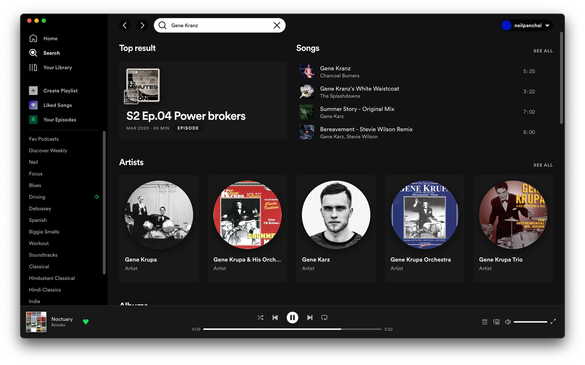
But, when I try to do nothing more than search in your shiny app, I get this:

Hmm. What the fuck is this!? Why are you trying to be edgy? Ok fine, I'll scroll down to the bottom and click "Episodes". Looking for some Gene Kranz podcasts.

Album grid. A giant wall of Podcast cover art. If there is a piece of information about a podcast that is the least useful, that would be the cover art. If there is a piece of information that is the most useful, that would be the title of the podcast as well as the name of Podcaster; both of those things appear to be either cut off or not visible. There is no other way to go through 18 pages of podcast search results. No list view. No compact view. This is all you get. I don't do memes on my blog, but if I were, it'd be full of them. That's the feeling right now.
There are so many terrible UX/UI patterns everywhere in these tech companies. Apple, Google, Spotify, Netflix, Microsoft, Amazon, etc; I wish someone would pay me a yearly salary to just write about them. I would. I want to go yell in these companies. Hire me and hand me the entire UX/UI department. It would be called the "Department of Functional Interfaces".
And, I'm not even mad. Just desensitized by your assault, Spotify. Your buddy, Apple Music, sucks too.
Foobar2000? Where are you? Do you still have that tattoo on your arm that screams "FUNCTIONALISM"?