Oh sorry, I was on mute!
Published on:
I ranted on HN the other day about Google Meet's user interface gore.
Aside: Imagine you’re driving down the road and you need to make a right turn. Well, for some reason the steering wheel is stowed away and disappeared! You need to hover your hand around the center console in a specific area to be able to expose it. Out comes the steering wheel and now you can make a right turn.
Google UX/UI team: Please fucking make the mute/unmute button visible at all times.
Seems like someone at Google read the comment and the bottom bar is now always visible. It used to autohide after 3 seconds and it was one of the most infuriating things about Google Meet.
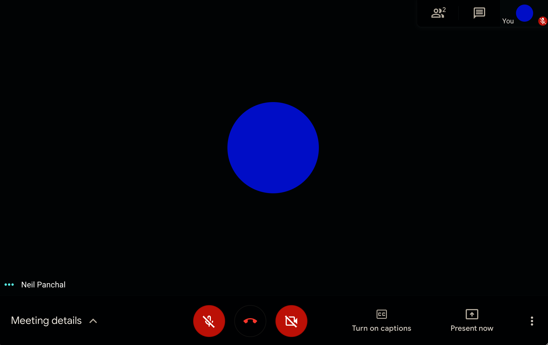
Knowing if you're muted or unmuted is probably the number 1 most important interface element of any A/V conference application. What's more surprising is that are other icons on the top-right corner that are always visible. So, someone at the Google UX/UI team thought that the mute button is less important and the whole bottom bar must autohide to clear the clutter. Ooofff.
UX/UI field is regressing
HN comment describes well - this is a common pattern, not an exception. We've just seen exactly that.
Isn't this sort of a Fizz Buzz for a UX/UI design professional? I don't mean to demean anyone, but I see this sort of a thing literally everywhere. Hiding important and absolutely crucial information (that can make or break your product) in the name of minimalism. Coming out of a company that has one of the highest hiring bars for software engineering, and yet, their products have such an awful UX/UI. This isn't an exception, it is a pattern.
What do you know!? The exact Google Meet pattern is repeated by UX/UI team at Microsoft!

After a few seconds, the control bar disappears, but the left-hand side panel is always visible. Of course, it does not have the mute/unmute button.
Engineering Rigor + UX/UI
I am speaking like a broken record, but UX/UI field needs to be taught like engineering classes. From the ground up, from fundamentals, from the basis of human behavior, from an analytical standpoint, with experimental insights, and then a mandatory - "Aesthetics is secondary" course. If your knee-jerk reaction to what I just said is "But, Aesthetics sells." - yes it does, if you're selling trinkets and wind-catchers at a tourist shop. Not for business-critical applications.
UX/UI professionals need to study deeply how humans and machines interact. I remember referencing the classic High Performance HMI book many years ago in engineering college. Obviously nuclear powerplant operators and their interface needs are not exactly the same as a corporate manager trying to make a funny joke out of "Oh, I was on mute.", but I think there is some value in atleast understanding the methodologies and formalisms. Engineering rigor and systems engineering approach can be applied to many other fields.
Another resource that's more appropriate for consumer-facing UX/UI is either hiring the Nielsen Norman Group or referencing their excellent list of articles. I consider them to be the gold standard of UX/UI guidance. Do not, I repeat, do not listen to the usual Google results that show when you query "UX/UI tips". Study these instead:

Bonus Puzzle

Is the call currently muted or unmuted? Is it showing the current status or future state after I click the button? Which one is it? Why isn't it a toggle switch with ON and OFF written on either side?
There is so much to talk about. Ok, I'll mute myself for now.