The Design of Diskprices.com
Published on:
I was browsing the interwebs and came across this beauty: https://diskprices.com/
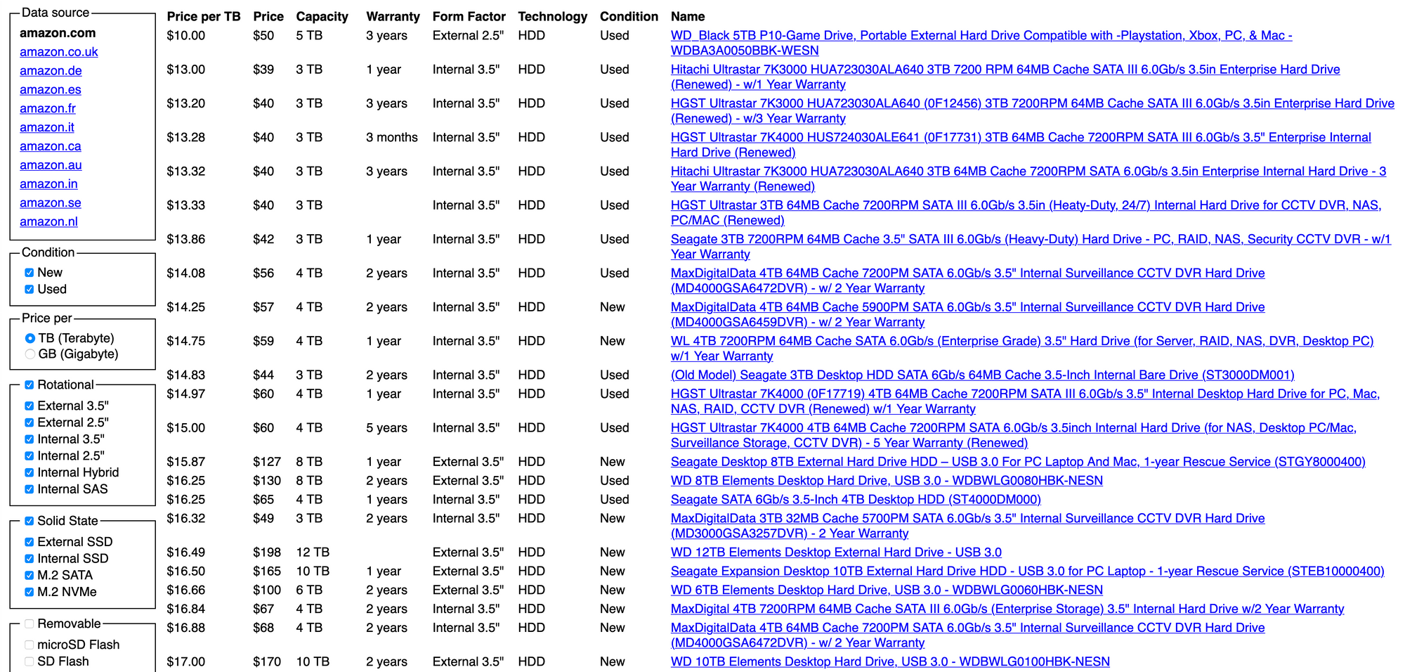
There is a distinct absence of a header, branding, anything that takes away screen real-estate. The design of Diskprices.com orients towards what the user came to the website to do - to look at the list of available hard drives and compare their prices. It's in the domain name!
Furthermore, the performance of this website is stellar. It loads almost instantly. And the list (although it's not sortable) gets the job done, it is sorted by price already which is the most important attribute.
Diskprices.com deserves the UI/UX award of the decade. We've lost our ability to design user interfaces laser-focused on the user. Instead, we have purple gradients, scroll jacking, responsive bullshit, emojis, animations, and many other things designers do today. The utilitarian approach of Diskprices.com is refreshing, although the contemporary designers cast it off as 'brutalist design', thereby marking it as a statement of fashion.
The creators of Diskprices.com didn't just do this by chance, it is a deliberate attempt as stated in the FAQ:
Quoting:
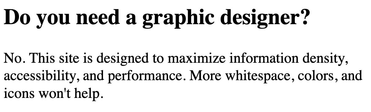
Do you need a graphic designer?
No. This site is designed to maximize information density, accessibility, and performance. More whitespace, colors, and icons won't help.
If the design of the object, service, or product is to enable the user, why is it shameful to keep it undecorated?
Folks at Diskprices.com, if you're reading this, beer is on me if we ever meet.