Berkeley Mono December Update
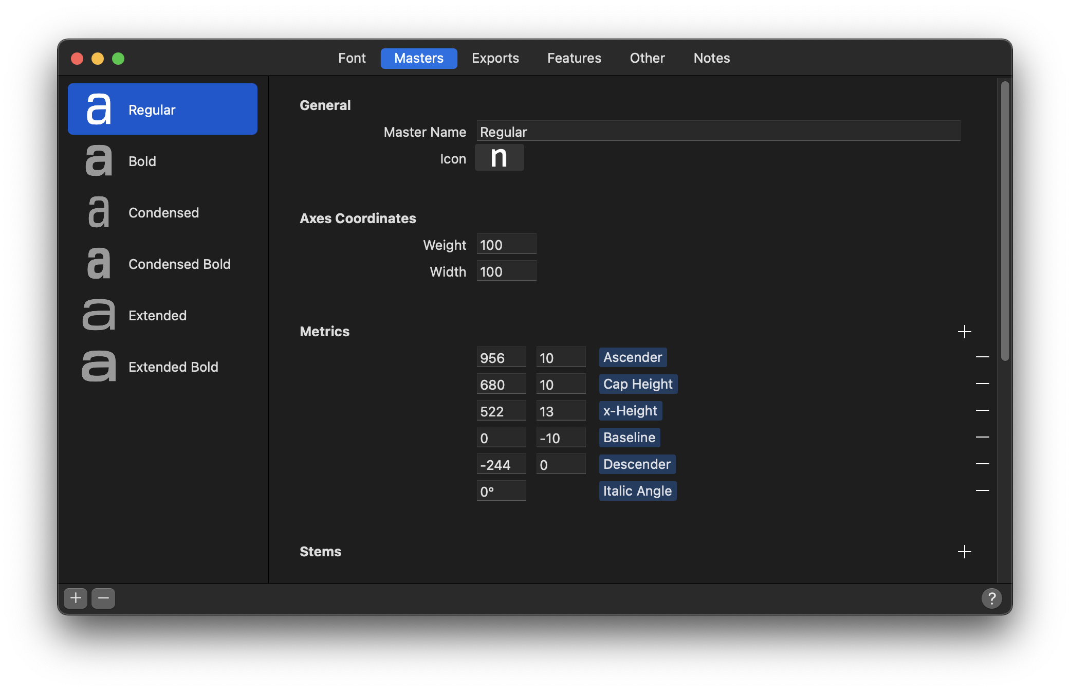
It's been a while since I had announced the release of Berkeley Mono. The more I examine it under scrutinous eyes, the more I find that there is more work to be done. At one point, I had the following masters going through the final tuning:
One of the evenings, I was reading about true type fonts history on Wikipedia and Andale mono captured my attention. The fitting in Andale mono was unlike any other monospaced font.
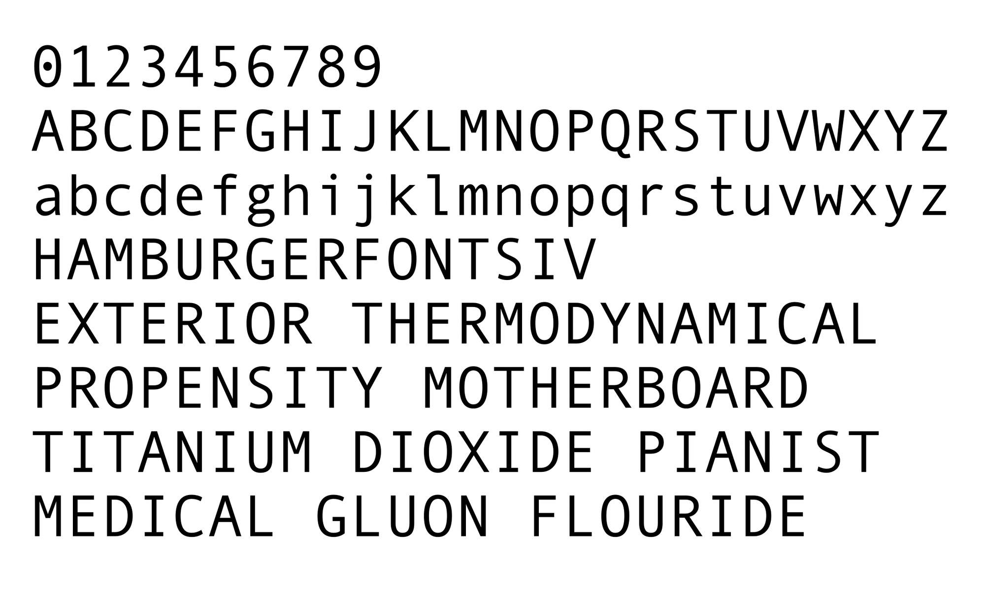
It would be interesting to capture some of the glyph widths (which dictates fitting in monospaced typefaces) in Berkeley Mono.
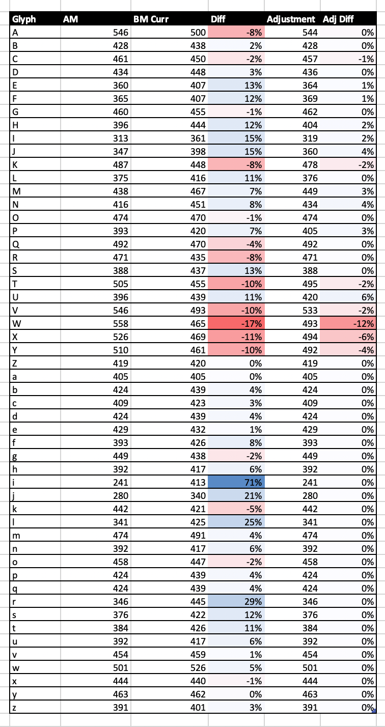
Modifying the widths of Berkeley Mono uppercase glyphs to follow Andale Mono widths (some exceptions, notably due to the open apertures of 'C' and 'S' glyphs), we get the following result.
Before adjusment:
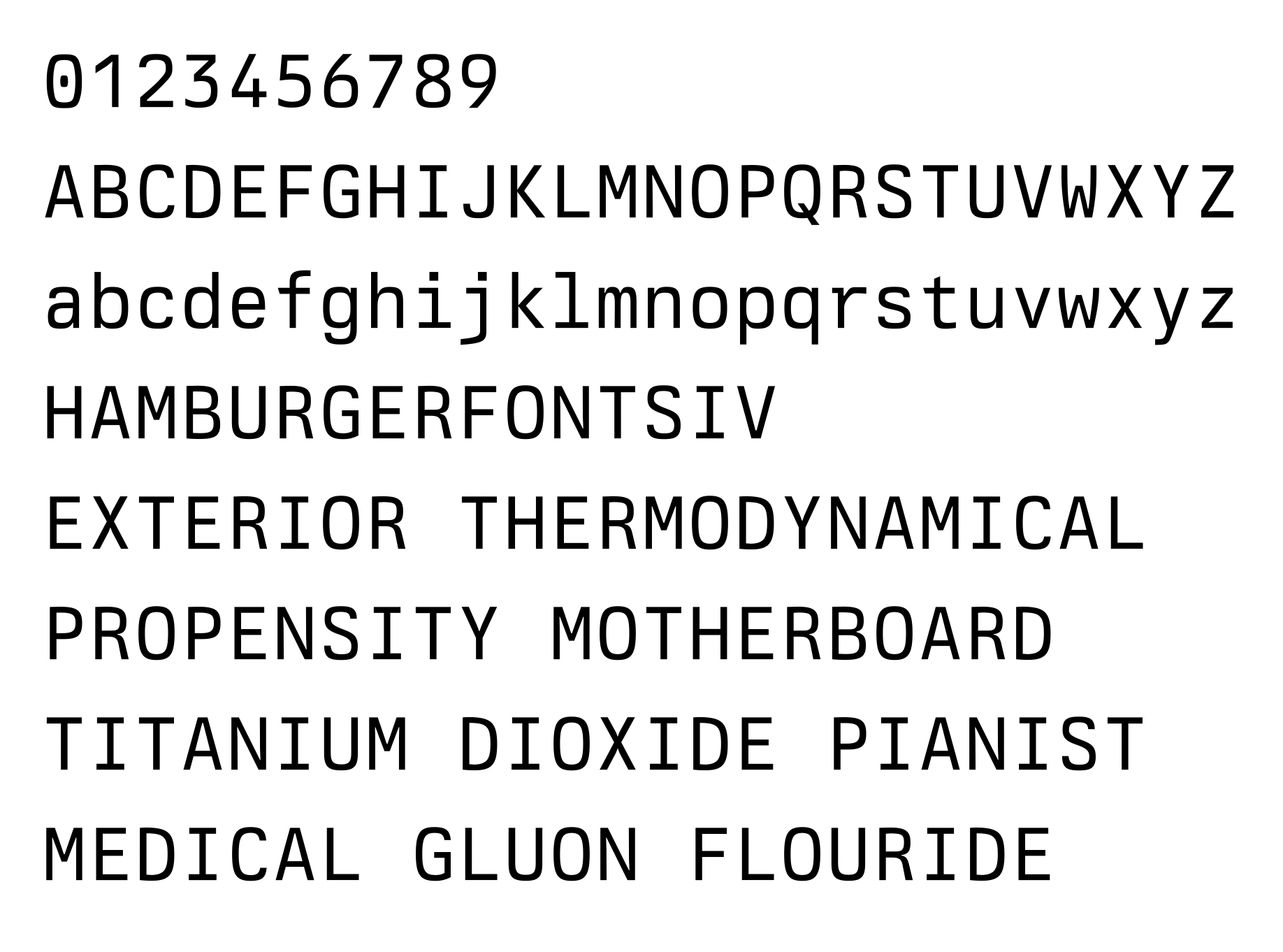
After adjustment:
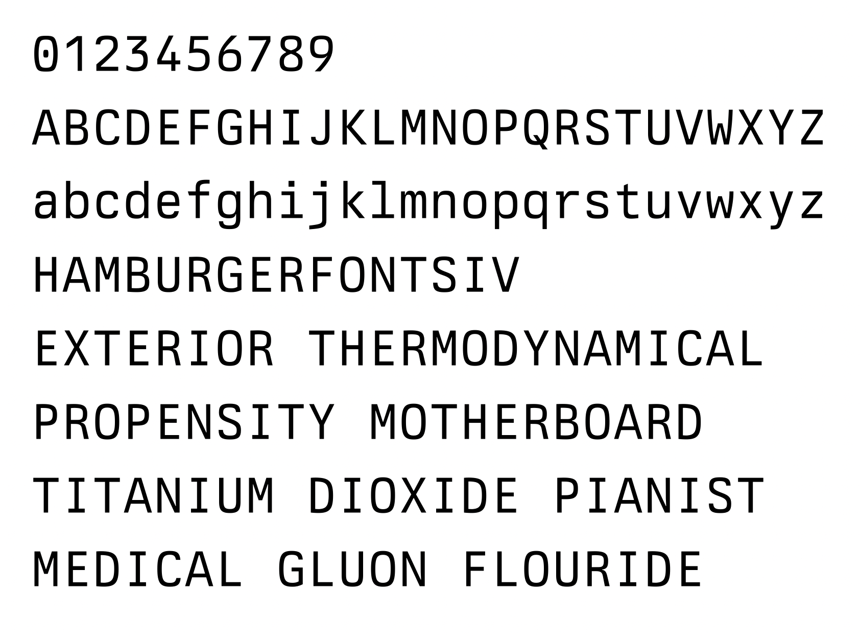
I think this experiment failed, but it is hard to tell. I'll mess with it a little more and see what happens. Typography is a frustrating endeavor because of decisions of this sort, there is no right or wrong answer and any attempt at objectivity fails horribly. It is very much 'trust your eyes and instinct, everything else is wrong' craft.
Perhaps the silver lining is the satisfaction of using the typeface; knowing that I built the 'translation layer' between abstract data (words and symbols) into two-dimensional representation – combining centuries of hieroglyphic standards (the written English language) and aesthetic, functional, and engineering requirements – is kinda cool. It very much feels like an art-school equivalent of developing a layer in the TCP/IP network stack. What a strange thing to say! Or, with spoken language, I am thinking – Abstract idea from person 1 -> Preprocessing (Frontal cortex) -> Language or compression (Fusiform gyrus? I don't know) -> Electrical signals (Facial muscles, Voicebox) -> Transmission over the air modulated by pressure levels -> Decoding (Hearing) and decompression (Comprehension) -> Abstract idea to person 2 (with some loss of fidelity). With typography, we are just swapping out the physical layer from sound to light.
I should really get back to work.